LED Spectacular
Gilmore Group
Project Info |
Location | Las Vegas, NV
Project Date | 2008
Lexicon | Commercial
Responsibilities | SD, Design, Visualization
Created for | Gilmore Group
Image Specs |
3D Renderings |
3DS Max, Photoshop
Original Image Size(s) |
Sizes Vary
Description |
A large developer in Las Vegas was building a new residential tower on the north-end of Las Vegas Boulevard. They wanted to include a large sculptural LED sign integrated into the tower.
They wanted something different that could possibly stand alone as a dynamic element.
The ideas was to generate more sparkle on the north end of the strip.
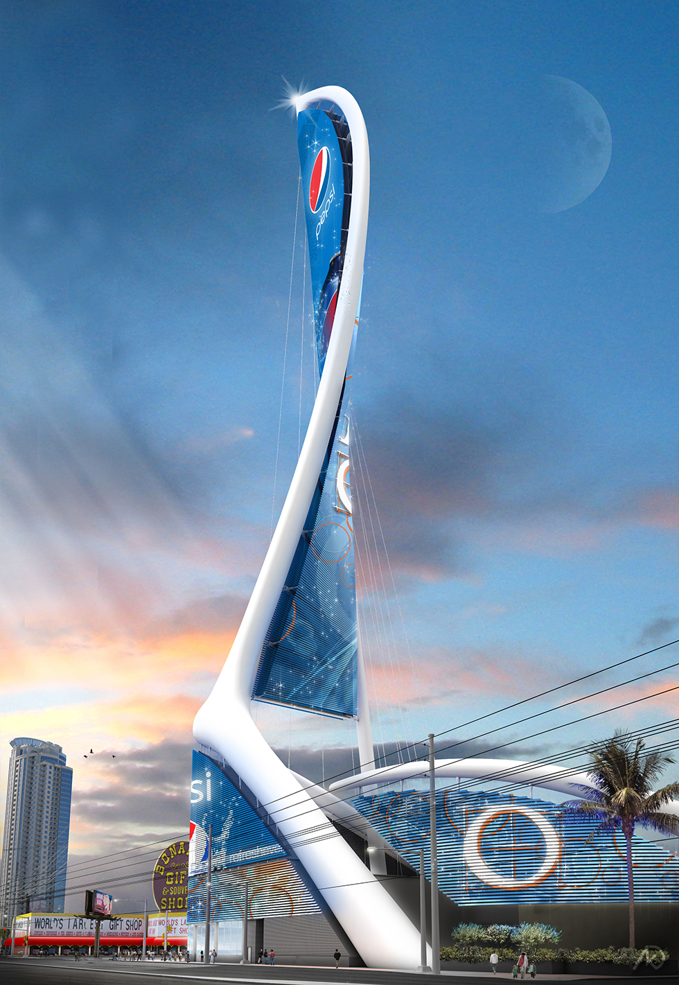
The client wanted something big that faced both north-south and east-west. The idea of a twisted element was brought-up and explored.
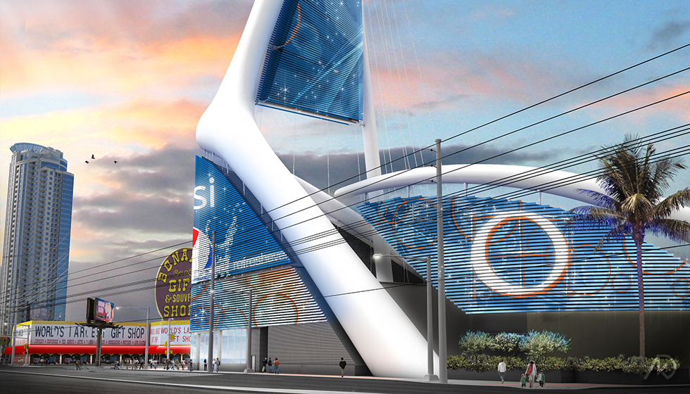
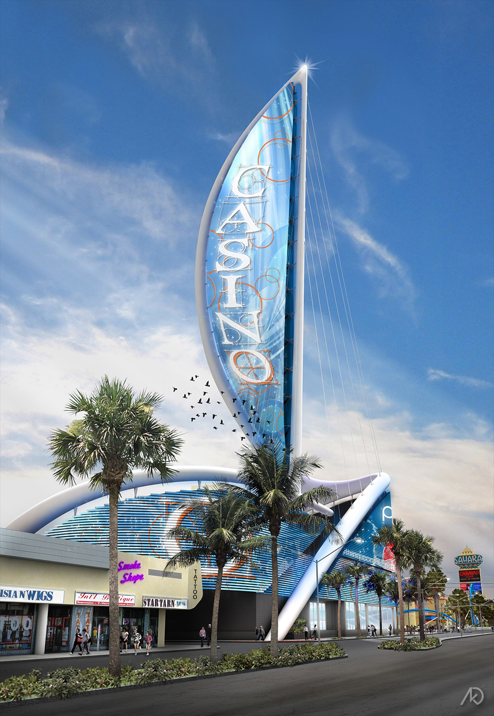
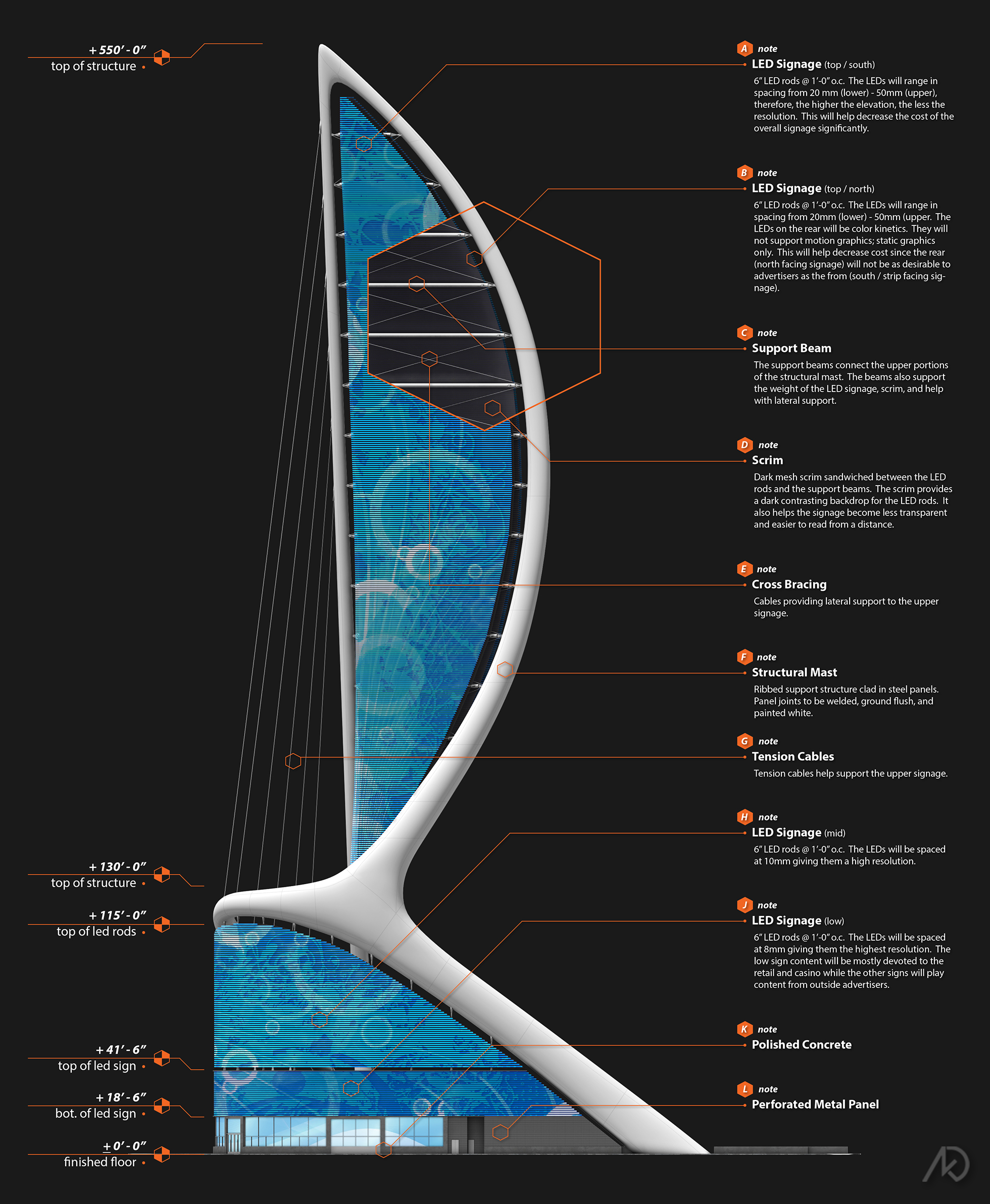
We designed a large sign supported by a three-point mast and made of LED rods. The rods allowed us to twist the sign and give it a more dynamic shape.
The sign had to be self-supporting as it would be constructed in Phase 1 while the tower would be built at a later time.
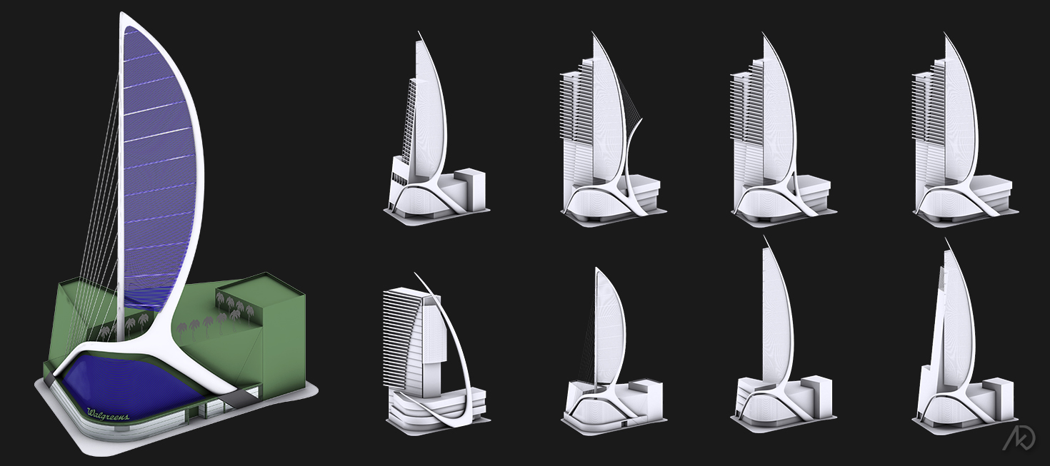
| Early Studies
Initially, the project was supposed to include a residential tower, therefore most of the early studies show how the spectacular works with the tower and podium.
All studies were basic form studies as the overall programming for the project was not yet complete.
The client really liked the large “sail” look and wanted to see some possible variations.
Concept |
There was no real concept in play here. The client wanted something big, different, and extremely visible.
Keep in mind that initially the whole development was to include a large tower/podium and the signage was to be integrated into that structure. You can see from the early studies that the tower was roughed-in as a major factor in the overall design.
The very first design looked like a 550′ Nike swoosh, and had to go. It was the most simple version (seen above in the “early studies” image). It was too simple as the sign was to only hang from it and it offered only one directional viewing.
The next step was to create signage which could be viewed from multiple directions. This meant we had to twist the sign somehow. We made a few early studies showing just this, but he twisting looked too forced and not too clean looking as it depended a great deal on attaching to the tower structure.
At this point the client informed us that the signage element would need to be “self-supporting.” This was due to the podium and signage were to be built first during phase one and the tower would come later during phase two or even phase three.
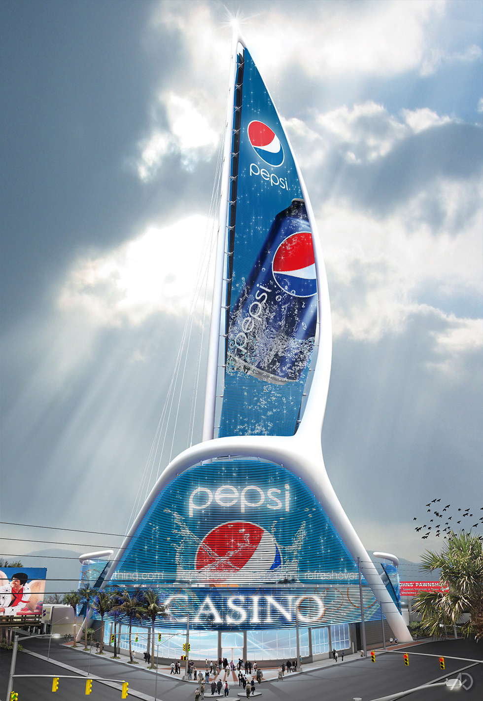
The signage now became a structure with three support points. The early studies looked like sailboat mast and sail, which the client seemed to like and wanted to explore more – so we did.
The mast allowed us to twist the vertical sign area. This was also achieved by using an LED rod system (as opposed to an LED mesh). The rods were more stable and higher resolution.
The signage spectacular is made of 5 parts. The vertical double-sided sign is visible from multiple directions. The large curved central sign has a large surface area. Below that is a smaller band to be used mostly for the retail location in the podium base. Finally the two curved “wings” flank each side of the podium.
 Akueous Design